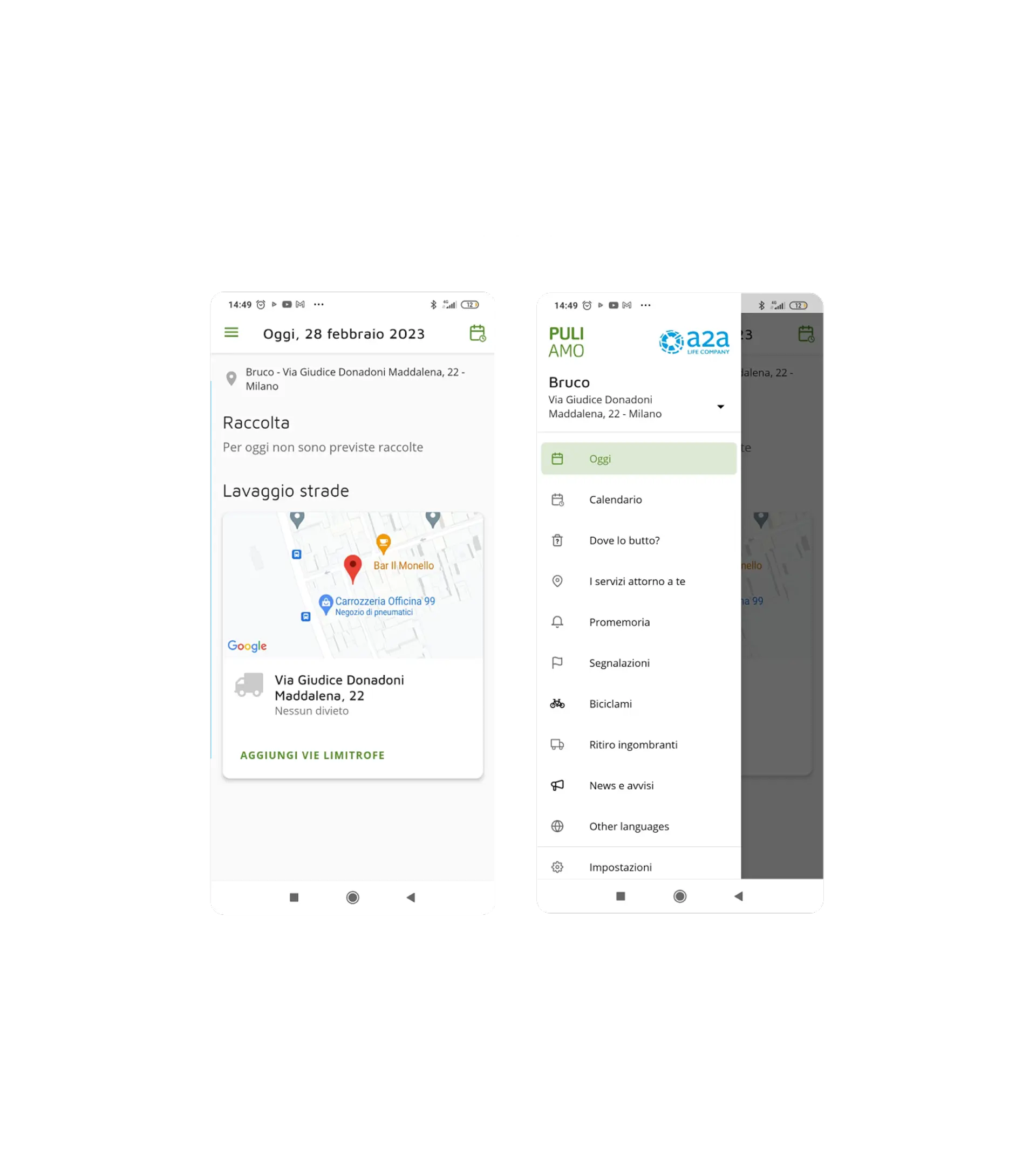
Puliamo is a mobile app powered by AMSA, a company that manages the collection and disposal of municipal waste in the city of Milan.
The goal of this project was to conduct a usability analysis of the Android app and provide recommendations for improvement based on the results. Usability tests and heuristic evaluation methods were performed, which led to the identification of usability problems, pain points, and areas for improvement in the app, from which we started to design a new, more modern version.
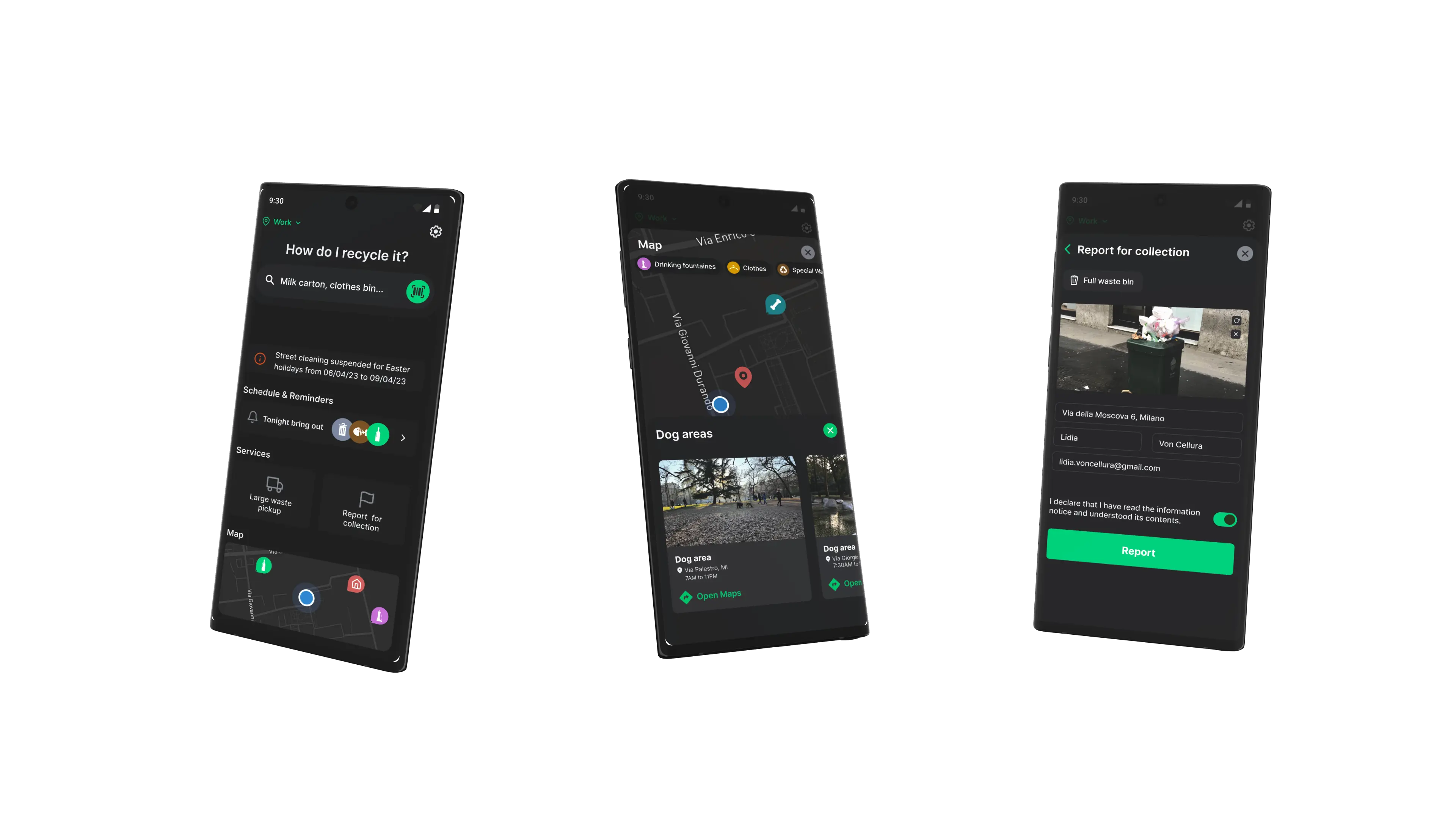
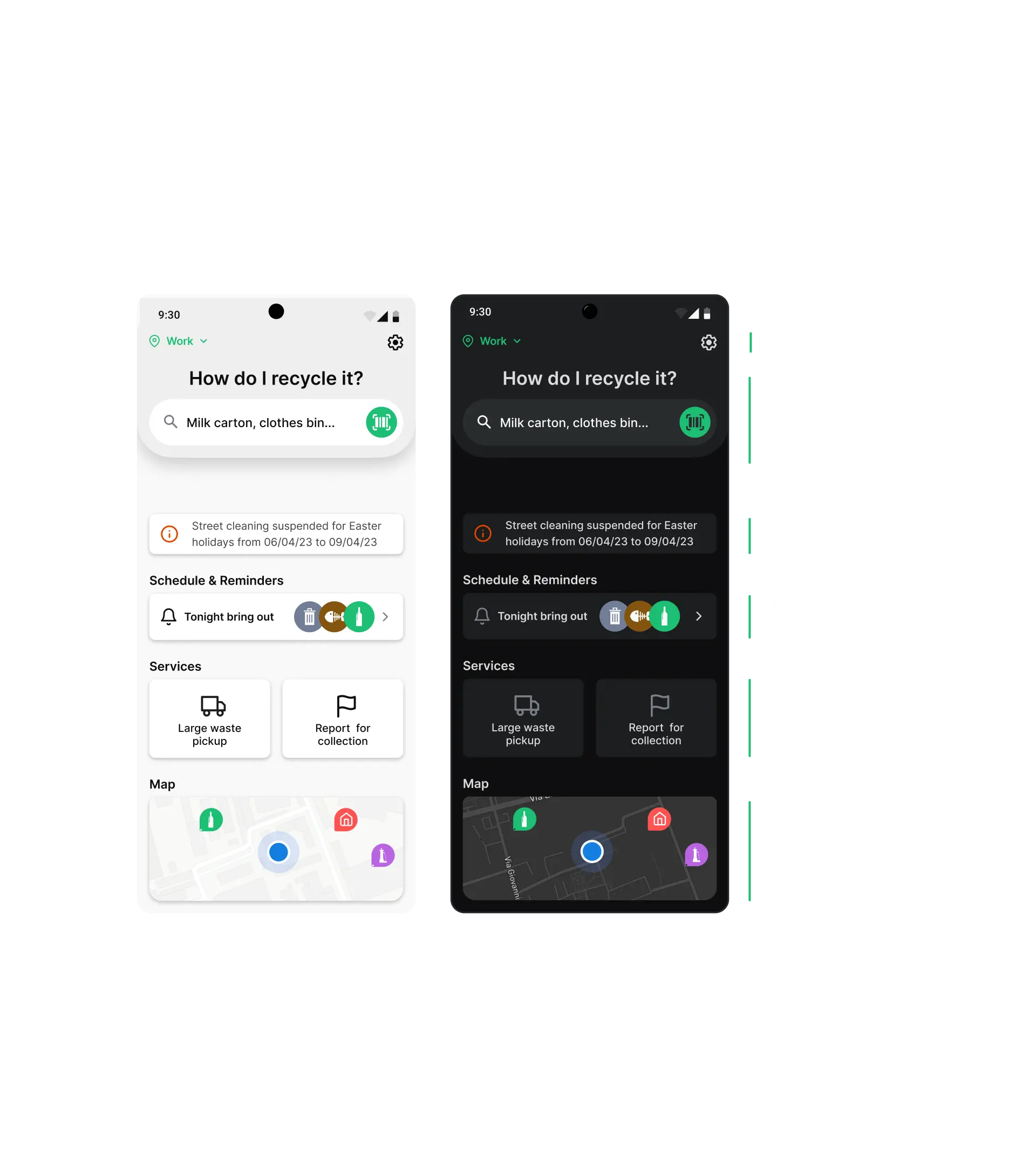
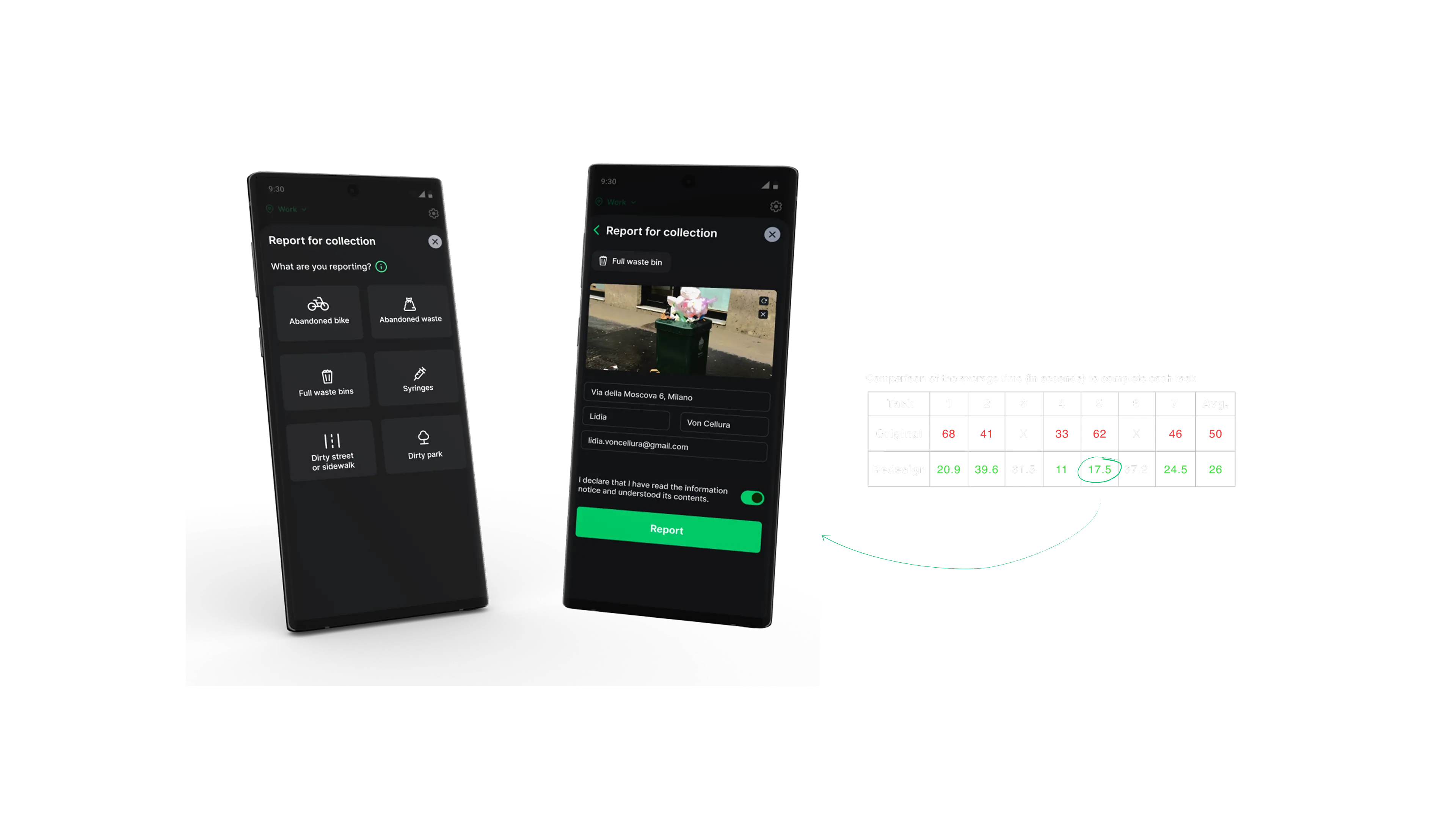
The new version of Puliamo is a low-energy app that is simple and intuitive to navigate. The app was redesigned by rethinking its architecture, making all functionality accessible directly from the homepage.
The app redesign was driven by insights gathered through user testing and heuristic evaluation. Information architecture was refined using card sorting and tree testing, informing the development of two mid-fidelity prototypes that were iteratively tested with users.
These insights led to the creation of the final prototype, which presents iself as a modern reinterpretation of the original app with a nearly fully revised structure, an intuitive and flexible content organization that places all core functionalities directly on the home screen, and a dark mode designed for comfortable, low-power, and sustainable use.
Puliamo is a mobile app powered by AMSA, a company that manages the collection and disposal of municipal waste in the city of Milan.
The goal of this project was to conduct a usability analysis of the Android app and provide recommendations for improvement based on the results. Usability tests and heuristic evaluation methods were performed, which led to the identification of usability problems, pain points, and areas for improvement in the app, from which we started to design a new, more modern version.
The new version of Puliamo is a low-energy app that is simple and intuitive to navigate. The app was redesigned by rethinking its architecture, making all functionality accessible directly from the homepage.
The app redesign was driven by insights gathered through user testing and heuristic evaluation. Information architecture was refined using card sorting and tree testing, informing the development of two mid-fidelity prototypes that were iteratively tested with users.
These insights led to the creation of the final prototype, which presents iself as a modern reinterpretation of the original app with a nearly fully revised structure, an intuitive and flexible content organization that places all core functionalities directly on the home screen, and a dark mode designed for comfortable, low-power, and sustainable use.

Scroll with mouse or with UP and DOWN arrows.